Ad Hoc
Senior UX Designer Enterprise level UX Design and Research.
Led the delivery of design work on the applications US citizens use to find help when applying for healthcare on Healthcare.gov.
Design System Component Optimization
Contributed to the design libraries and design systems, providing visual design and brand artifacts. Specific work on the Location Search Pattern component created an integral component to the user’s flow when identifying their location for help providers.Challenge
Identified an inconsistent component used across the applications users use to find help when applying for health care. Independent applications created a disconnected user experience when using the location search pattern.
Getting Started
Worked in a cross-team collaborative process with the Design System and Accessibility teams to create a new pattern that standardized the location search process for all applications.
Competitive Analysis: State based exchanges
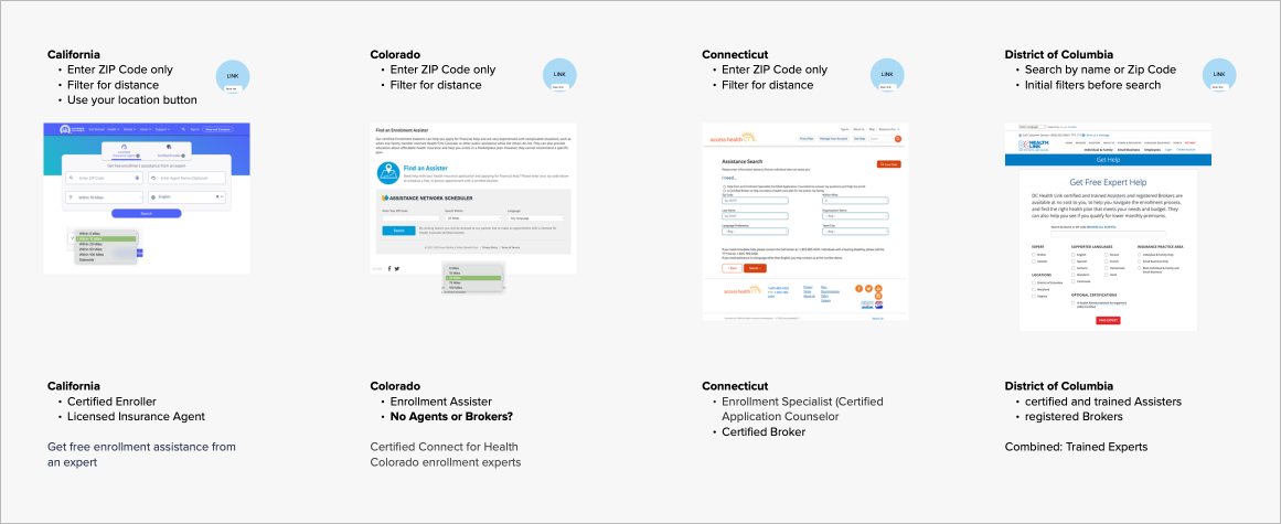
Researched best practices and created a competitive analysis of our indirect competitors, state based exchanges, to understand their strengths and weaknesses in relation to our pattern.

Design System
Created the necessary documentation and developer files to implement the new pattern.

Recommended Design
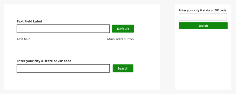
The standardized location search pattern across four applications used to search for help.
 Outcome
Worked in a cross-team collaborative process with the Design System and Accessibility teams to create a new pattern that standardized the location search process for all applications and improved the user experience.
Design Work and User Testing
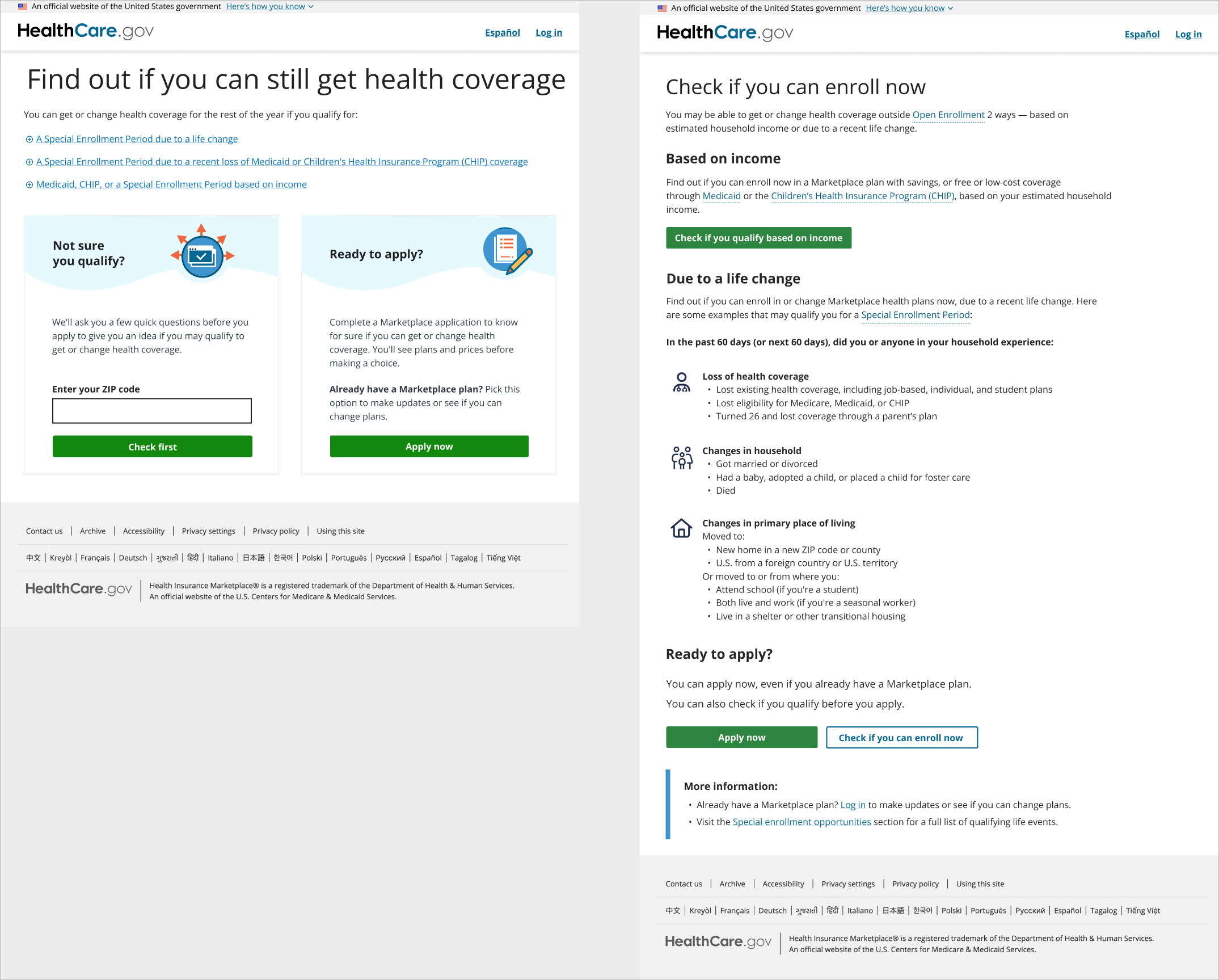
The Special Enrollment Period screener is a tool that allows users to pre-check their eligibility for enrollment outside of the open enrollment period.Production and Recommended Designs
Created effective design work including design initiative briefs, discovery artifacts, UX flows, low and high-fidelity prototypes, and competitive analysis.

Research
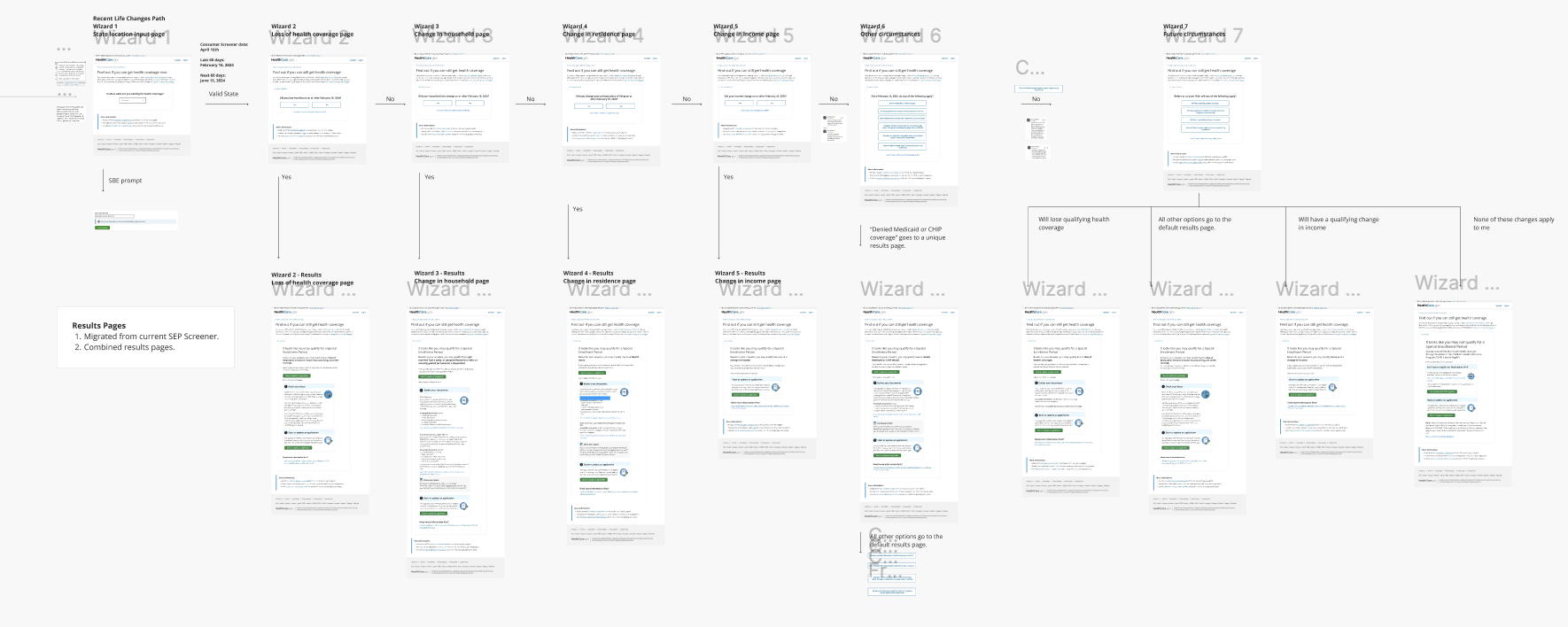
Starting with analytics and following a user’s flow, we identified an inefficiency with how users completed the screener.
Prototypes
I created prototypes in Figma to make the multi-step user task easier to navigate with users.

User Testing
Working with the User Research Team at the Centers for Medicare and Medicaid we created a plan that informed the user research studies conducted by L&M Policy Research. I worked closely with these two teams during the studies to ensure that the study captured the user’s feedback effectively.
Outcome
The prototype tested successfully across all demographics to complete the user’s task.